What Is Colour Temperature?
Lighting colour temperature, measured in Kelvins (K), defines how warm or cool light appears to the eye. Lower Kelvin values produce a golden, cozy glow, while higher values create a crisp, daylight-like tone.
Warm white (2200K – 3000K): golden, soft, and inviting.
Neutral white (3500K – 4100K): balanced and natural, similar to midday sunlight.
Cool white (5000K+): bluish, clean, and energizing.

Think of colour temperature as the emotional layer of lighting. Just as music sets the mood in a room, light temperature defines how the space feels—relaxing, focused, or refreshing.
How Colour Temperature Shapes Mood
Every temperature evokes a different emotional and visual experience.
| Colour Temperature |
Tone |
Mood |
Best For |
| 2200K–2700K |
Warm white |
Calm, intimate |
Bedrooms, living rooms |
| 3000K–3500K |
Soft white |
Welcoming, comfortable |
Dining areas, hallways |
| 4000K–4500K |
Neutral white |
Clean, natural |
Kitchens, bathrooms |
| 5000K–6500K |
Cool daylight |
Bright, focused |
Home offices, studios |
Lighting Strategies by Room
Living Room — 2700K to 3000K
The living room thrives on warmth and relaxation. Soft light around 2700K creates an inviting atmosphere ideal for unwinding or entertaining. Alabaster or frosted glass fixtures enhance this sense of coziness.
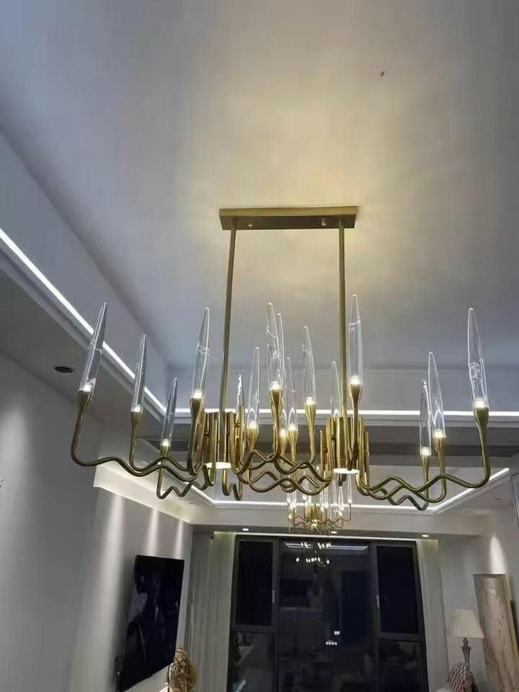
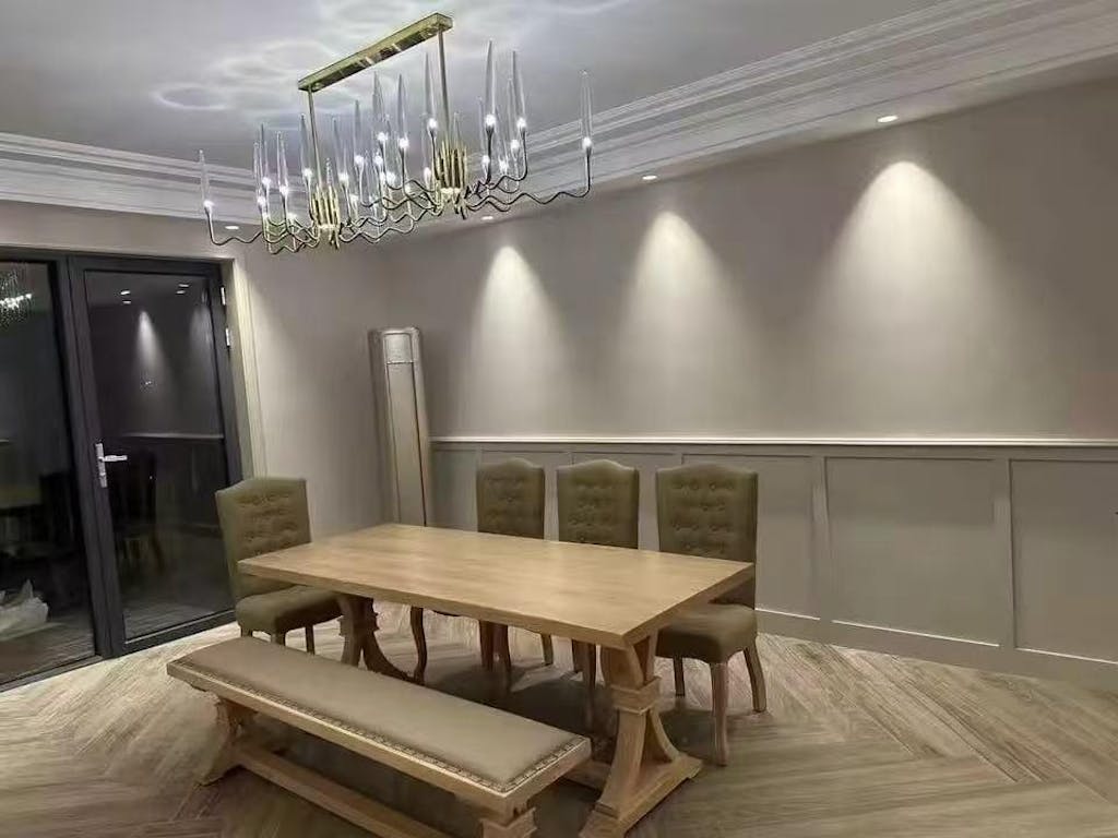
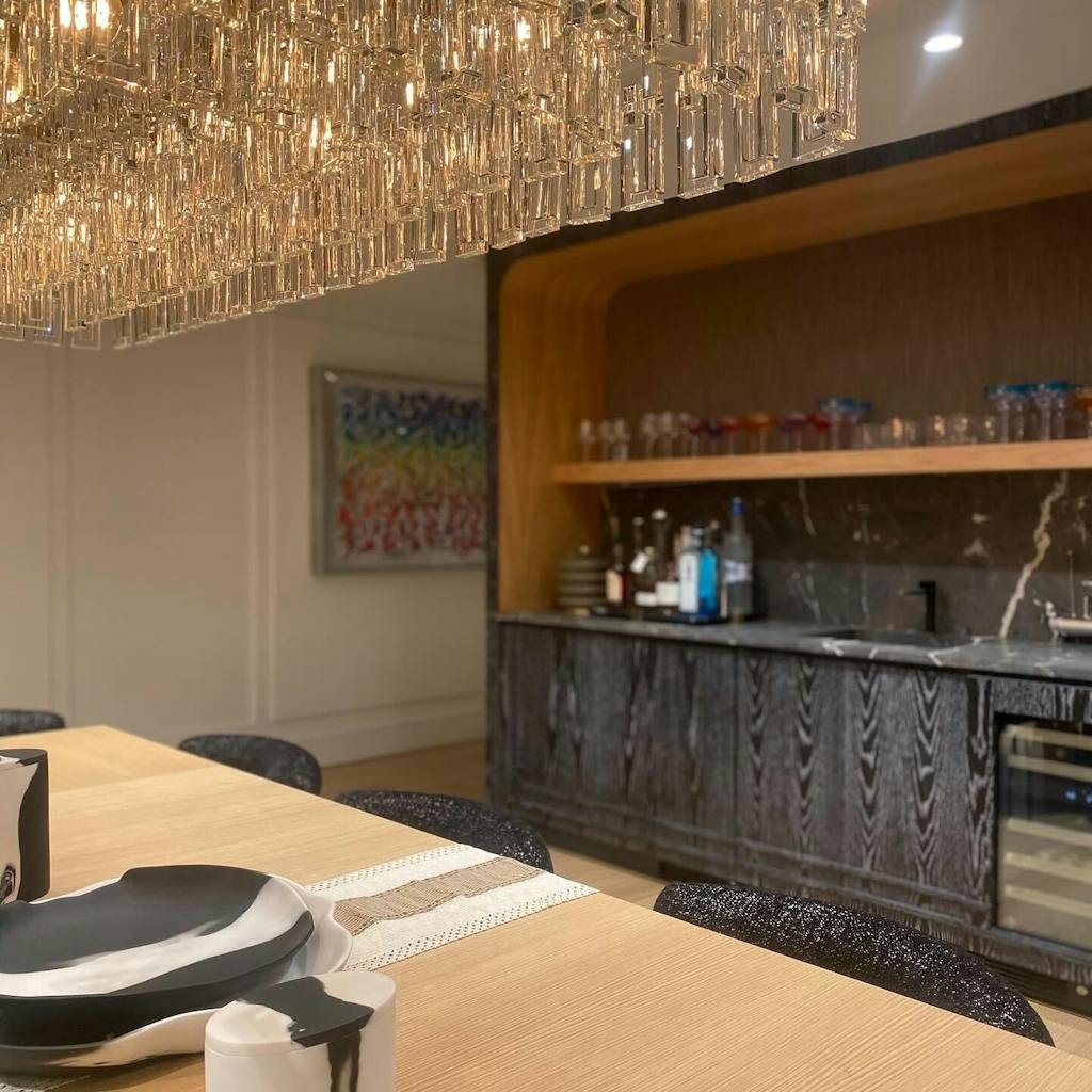
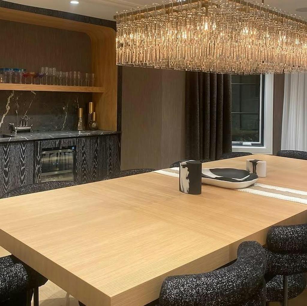
Dining Room — 2700K to 3200K
Lighting in the dining room should flatter both people and food. A chandelier at 3000K highlights natural tones and textures without overwhelming warmth. For drama, consider accent lighting on walls or art pieces in a slightly cooler tone.
Kitchen — 3500K to 4000K
Kitchens demand clarity and precision. Neutral white light around 4000K enhances visibility for cooking and cleaning. To balance function and style, pair under-cabinet task lighting (4000K) with pendants or island lights in a softer 3000K.
Bedroom — 2200K to 2700K
Warm tones encourage rest and relaxation. Avoid high-Kelvin light in bedrooms—it can suppress melatonin and disrupt sleep. Look for dimmable wall sconces or ceiling fixtures that adjust down to 2200K for a serene pre-sleep ambiance.
Bathroom — 4000K to 5000K
Bathrooms need brightness and clarity for grooming. Cool white (4000–5000K) replicates daylight, helping reveal true colors. For a spa-like feel, add accent lighting in a warmer tone around the tub or mirror edges.
Home Office — 4000K to 5000K
Cool white light improves alertness and color accuracy, supporting focus during work hours. A tunable desk lamp or linear pendant with adjustable Kelvin range ensures comfort during long sessions.
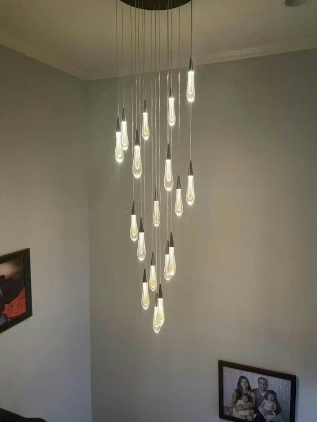
Hallways & Entryways — 2700K to 3000K
Set the tone the moment someone steps inside. Warm light makes transitions gentle and welcoming. If your home design leans modern, choose fixtures that diffuse light softly across walls to emphasize architectural lines.
Matching Colour Temperature with Materials & Finishes
| Material / Finish |
Ideal Colour Temperature |
Effect |
| Natural Brass |
2700K – 3000K |
Rich, warm tone with classic depth |
| Polished Nickel |
3000K – 4000K |
Clean, bright, and modern |
| Bronze |
2700K |
Deep, intimate, vintage appeal |
| K9 Glass / Crystal |
3000K – 4000K |
Sparkling clarity with soft reflections |
| Marble / Alabaster |
2700K – 3200K |
Gentle diffusion that enhances texture |
Designer insight: Aligning your lighting tone with surface materials prevents unwanted color distortion and enhances the true character of the finish.
Layered Lighting and Tunable Technology
The most beautiful interiors use layered lighting—a balance of ambient, task, and accent illumination.
• Ambient light sets the mood (warm, diffused).
• Task light brings focus (cooler, directed).
• Accent light highlights art, architecture, or texture (variable tones).
Modern tunable white systems (2200K – 5000K) allow you to adjust colour temperature throughout the day: warmer in the evening for calm, cooler in the morning for energy. It’s the next step in human-centric lighting design.
Practical Tips for a Balanced Lighting Plan
• Mix, don’t match. Contrast warm and cool zones for dimension.
• Mind the finishes. Brass, bronze, and wood love warm light; chrome and marble shine under neutral tones.
• Use dimmers strategically. Adjusting brightness can mimic the effect of changing temperature.
• Think natural rhythm. Daylight shifts throughout the day—your lighting should, too.
• Test before you install. Always view bulbs in your space before finalizing. Wall colors and fabrics can alter perceived tone dramatically.
Visual Colour Temperature Reference
| Light Source |
Approx. Temperature |
Tone |
| Candlelight |
1800K |
Very warm amber |
| Soft incandescent |
2700K |
Warm white |
| Morning sunlight |
3500K |
Neutral white |
| Midday daylight |
5000K |
Bright white |
| Clear sky daylight |
6500K |
Cool daylight |
This simple reference helps visualize how each light setting will influence your interior tone and mood.
Final Thoughts
Lighting colour temperature is more than a technical setting—it’s an emotional design choice.
By understanding how different tones affect mood, material, and function, you can create spaces that feel balanced, intentional, and uniquely your own.